Let’s jump back in with Spotify
Having grooved to over 2000 songs for 23000 minutes and practically lived on the app last year, it's safe to say I'm head over heels for this platform. A loyal user since 2016, my fascination with Spotify's design and algorithm has only grown. Join me as we tap our feet to the rhythm of my journey with the app, exploring everything from the snappy UX copy to the burst of colors and those handpicked playlists that make my heart sing. Let’s dissect three key screens: the home screen, the current song player, and the whimsically named meatball menu on the song player screen.
The sparing use of vibrant green to highlight selected buttons or intended actions adds a refreshing touch. However, with the recent update, the screen appears a tad more clustered. It now presents me with the option to choose from eight playlists and various album selections for a quick musical dive.
I appreciate the nuanced details in the UX copy, such as 'Trending albums for you,' 'Your top mixes,' and 'Shows you might like.' The incorporation of 'you' gives the impression that the app tailors content specifically for me, igniting a desire to delve into fresh playlists that feel personalized. However, I find myself a bit puzzled by the absence of text in the header.
The problem I focused on
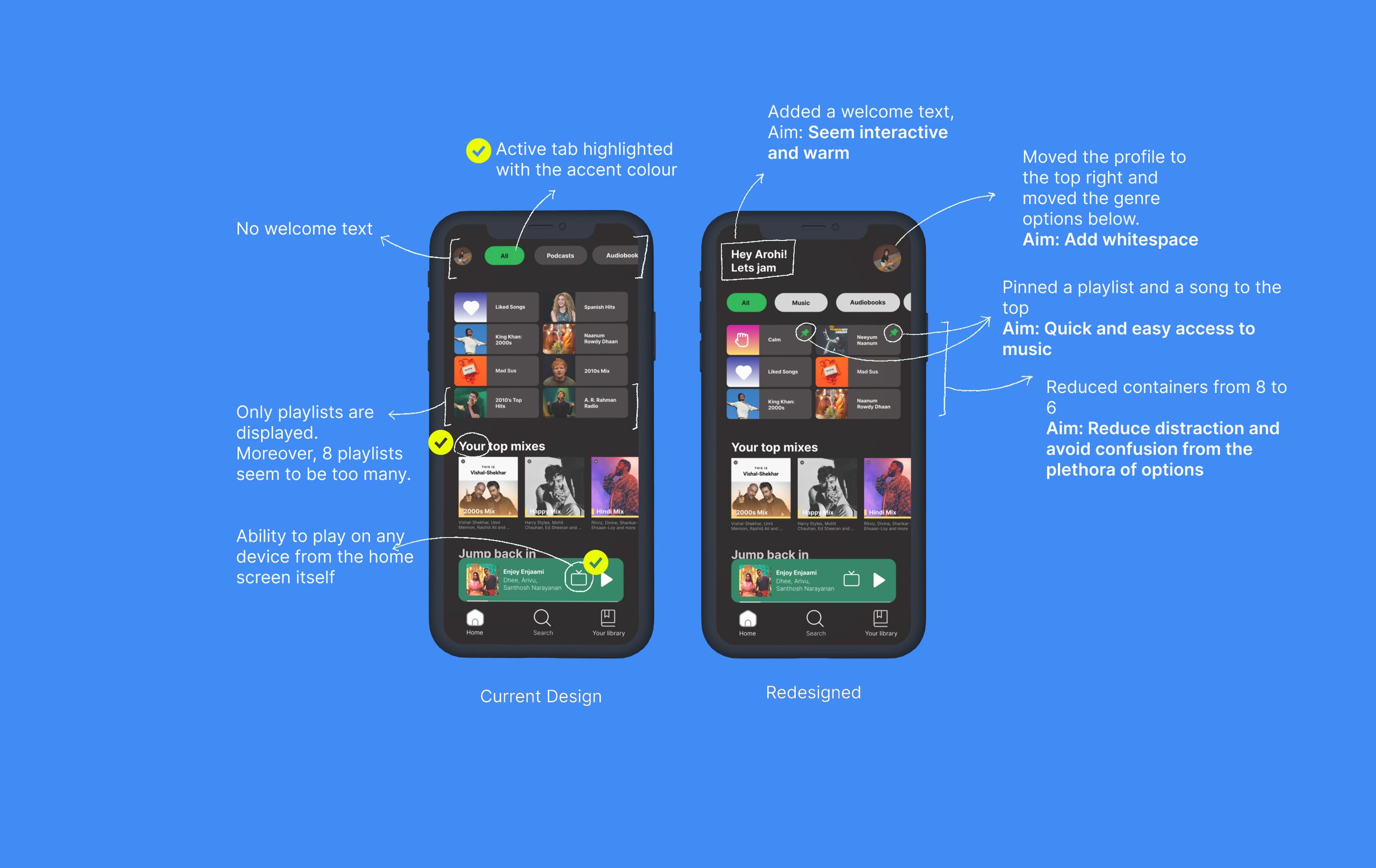
Problem Statement 1: Users experience a disconnect with the application because of the absence of microcopy on the home screen. Including succinct microcopy would introduce a personal element to the digital product, crafting an experience that resonates with the emotions of the user.
Problem Statement 2: Cluttered home screens force users into a choice dilemma. Incorporating whitespace can assist users in easily locating and accessing their favorite tracks.
Emphasis & Ideation
I opted to include a friendly 'Hey Arohi, Let’s Jam' to extend a warm welcome and add an extra touch of personalization. While the array of options excites me to explore new music and playlists, it also creates a sense of distraction, making it challenging to focus on a specific aspect. To address this, I introduced some white space at the top along with my own copy, and I scaled down the number of displayed playlists from 8 to 6.
Spotify holds significant importance in my life by serving as a source of solace, especially when I find myself overwhelmed. Music equips me to soothe my nerves whether I'm at home or out running errands. I have a set of go-to songs and playlists that I rely on to help me clear my mind.
During a specific user journey—my visit to Spotify to find a song or playlist to calm me down—I made an interesting observation. The home screen exclusively displays playlists, neglecting individual songs. In my redesign approach, I introduced the option to pin both playlists and individual songs. This way, as a user, I can swiftly access my desired song without the hassle of searching for a specific playlist or navigating through my library.
Shifting our focus
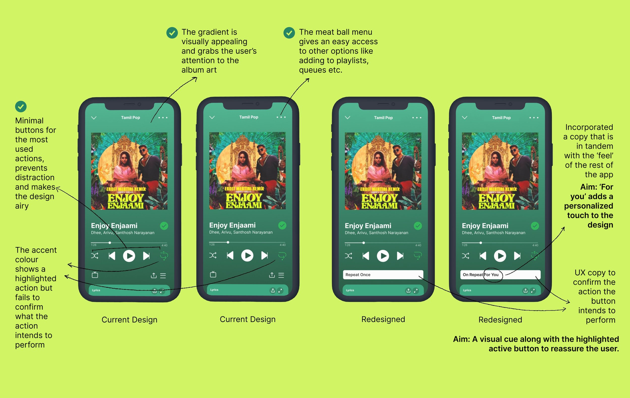
Moving on to the music player itself, the initial feature that captures my attention and wins my admiration is the placement of all essential buttons directly on the screen, eliminating the need to navigate through menus. The background gradient adds a captivating visual element, directing my gaze to the album art and enhancing the overall song experience beyond just audio. However, one element stands out to me—the repeat button situated at the right end of the screen.
While enjoying songs from a playlist, upon clicking the repeat button, it toggles into a repeat-once, and repeat this song on loop mode. Despite multiple attempts, I've struggled to make a song repeat multiple times using this interface. Each click on the button leaves me uncertain about the action performed, prompting me to resort to queuing the song repeatedly to achieve the desired outcome.
Key insights from my user-survey
66.7% reported they find it easy to repeat songs
However, 58.3% mentioned that the only way they knew a song was repeating properly was to make sure they hear it again. Else, they resorted to manually rewinding the song.
75.1% of the survey participants used Spotify multiple times a month, on various devices including smart phones, desktop applications, car play and smart devices like Alexa/Google Nest.
A common problem people seem to mention was the confusion between the two replay buttons and the actions they performed.
Problem Statement 3: Users face difficulty determining whether their selected song in a playlist will repeat while on the music player screen. Providing clarity about the expected outcome of their actions would offer reassurance, eliminating the need for them to manually replay the song.
The meatball menu at the top reveals a screen with three options—shuffle, repeat, and go to queue—below the song title. Each option is accompanied by UX copy beneath, likely intended to emphasize the action and promote an accessible design that encourages user interaction with both the button and its function. The objective was to extend this design philosophy to the main music player screen, fostering an accessible and user-friendly design. There was considerable confusion surrounding the repeat icons. Many users mistakenly interpreted the "1" as an indication of a song being repeated once, rather than understanding that it meant the continuous looping of a single song indefinitely. In my redesign, I addressed this by incorporating concise copy to clarify the action thereby acting as a visual cue.
Reflection
In wrapping up, there's still so much to appreciate about Spotify's design. The seamless integration across the web interface, iPad, mobile, and TV showcases a level of responsiveness that truly stands out. Looking ahead, I'm eager to dive into case studies exploring features like Spotify wrapped and the search screen. Beyond Spotify, my curiosity extends to understanding and redesigning user flows for other commonly used applications. The design landscape is rich with possibilities, and I'm excited to continue this journey of exploration and discovery. Stay tuned for more design adventures!


