If you like it then you should put a pin on it 📌
If you were to peek into my digital world, you'd find me nestled comfortably in the cozy corners of Pinterest. It's like my personal haven, my digital vision board and I'm quite the devote follower of this creative sanctuary of mine. Let's explore what makes me want to put a "pin 📌 ” on it. Join me as I trace my steps on the journey of creating a board and saving a pin to one of my boards, but with a twist. Along the way, we'll unravel the intricacies that make Pinterest not just a hit, but a true visual haven.
Ever heard the saying that too much information can overwhelm you? So, how do you present a screen brimming with ideas without bombarding your audience? Pinterest seems to have cracked this puzzle with its clever use of white space. Amidst the sea of inspiring images and ads, you never feel lost or suffocated by the screen's colours, thanks to the whitespace and padding surrounding the pins. The varying sizes of the pins add to the fun vibe, making the screen feel more like an exciting space. Each pin comes with a container housing the title and the profile that uploaded it, although not every pin includes all this information. The proximity between the text blocks and the pin creates a clear visual hierarchy for users to navigate.
Pinterest is a visual discovery engine for finding ideas like recipes, home and style inspiration, and more.
While Pinterest aims to be a hub for creativity and idea-sharing, there's room for improvement in the user experience of creating boards. Despite its promise of simplicity, navigating the board creation process can be unexpectedly convoluted.
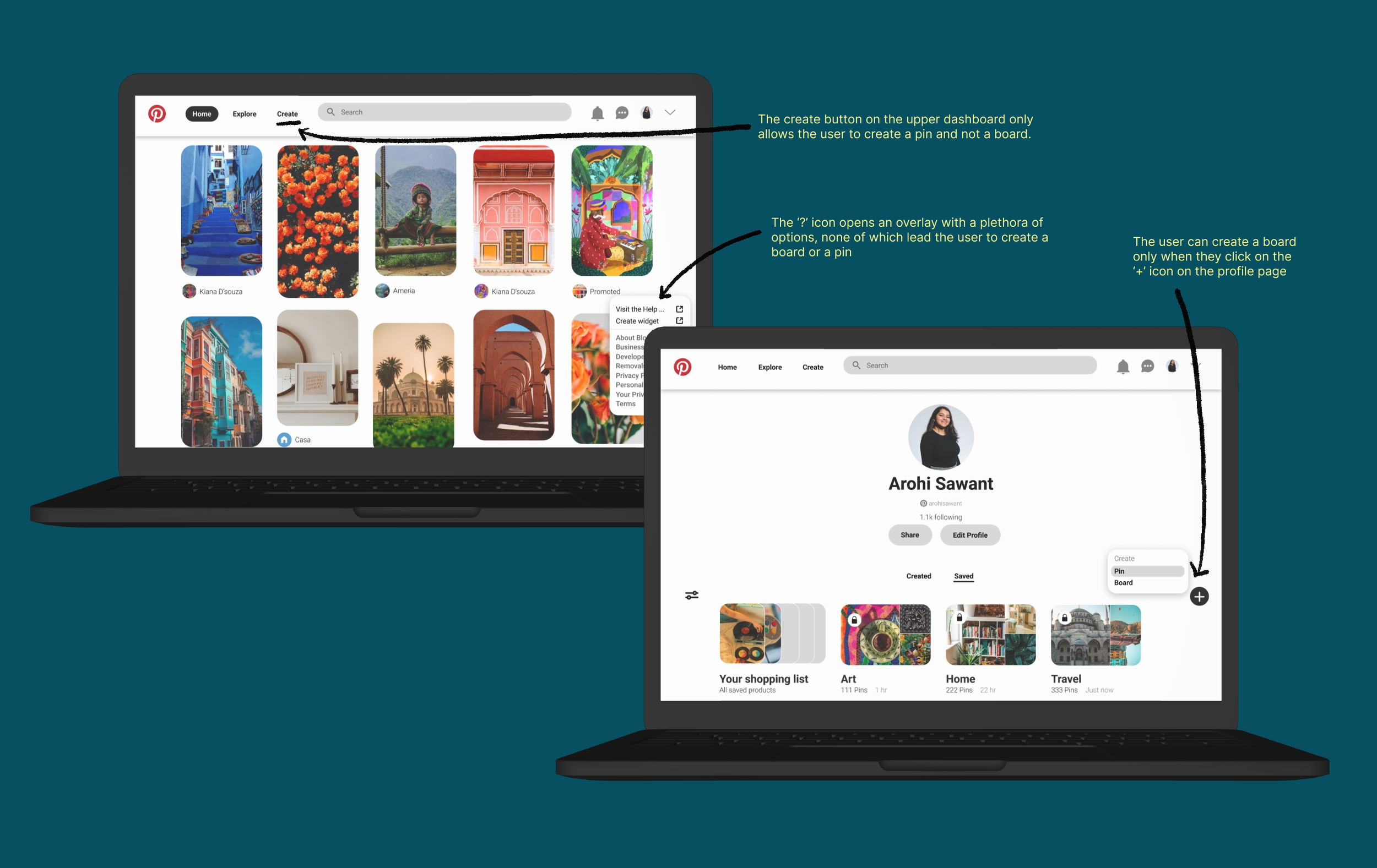
Problem Statement 1: Users struggle to create a board on Pinterest's web version due to the lack of a clear path to board creation. Simplifying navigation can ease this, reducing friction.
When I first went hunting for the path to creating a board, I stumbled upon it hiding behind the '+' button found on the ‘my profile’ screen. But here's the thing: Why does it have to be so elusive? Shouldn't something as basic as this be easily accessible right from my home screen?
Additionally, the upper dashboard features a 'Create' option, but it solely permits the creation of a pin, not a board.. This could confuse the user and contribute to a poor user experience.
Current User Journey:
Start from the home screen.
Navigate to 'My profile'.
Tap on the '+' icon.
Select 'Create a board'.
Proposed Solution: Let's delve into how I'd reimagine this whole experience.
First and foremost, let's refocus our attention on the home screen. This is where I anticipate the majority of our users will dedicate their time. Therefore, why not implement a solution directly on this page? I propose initiating this process by replacing the floating '?' button with a '+ Create' button instead. This modification would provide users with seamless navigation to create either a pin or a board as desired.
Additionally, I included icons alongside the text to enable users to create a board and pin, enhancing inclusivity for individuals with diverse literacy levels.
Moreover, we can also allow the user an option to create a board through the ‘Create’ button on the upper navigation.
Revised User Journey:
Start from the home screen.
Click on the floating ‘+’ icon on the bottom right
Select 'Create a board'.
Problem Statement 2: Users may feel perplexed when there are few visible changes to signify that their pins have been saved. Introducing a red hue can assist users in readily discerning their completed actions.
Here are two instances of ‘saving a pin’ we will focus on:
Instance 1: Alterations within the pin container
A micro interaction occurs where the save option transitions to a dark grey hue, and the "more options" prompt below transforms into an "edit" option. A feedback block appears at the bottom of the screen, acknowledging the action and offering the option to "undo" it. These concise feedback messages enhance the user experience without encroaching upon the screen space.
Instance 2: Expanding the pin to full-screen view
When a pin is clicked, it opens onto a new screen, prominently displaying the pin. The ample whitespace and padding subtly guide the user's attention. Information about the creator, including a brief bio and additional commands, is presented. Upon selecting the save button, it changes to a grey hue, signalling completion of the action.
Proposed Solution: One potential refinement would be to alter the colour of the save button to red, thereby emphasizing the action.
The red hue captures the user's attention and reinforces the action that has been executed. While the grey hue offers feedback to the user, the red colour amplifies the change even further. Employing high-contrast colours enhances the visibility of calls-to-action (CTAs), thereby boosting the likelihood of user engagement.
Lastly, let's direct our attention to the microcopy. Here are a few instances that caught my eye:
"Save some Pins to your new board", "Daily Inspiration", "That's all for today! Come back tomorrow for more inspiration" and so forth.
One tweak I'm itching to make involves injecting a bit more personality into the copy: "Let’s save some pins to your new board", "Daily Inspiration just for you", "That's all for today! More inspiration awaits you tomorrow" and the like.The goal here is to take my users on a journey where they feel like the ‘main character’, with a companion guiding them along the way.
Reflection
In conclusion, there's still so much to appreciate about Pinterestʼs design - their experiences across the various platforms and devices and the tiny nuances which make one get inspired and lose track of time when surfing through the pins. By tackling the usability challenges detailed above, we can make the platform more accessible and enable users to curate and share their inspirations with greater ease.


