Packaging Design | Art direction
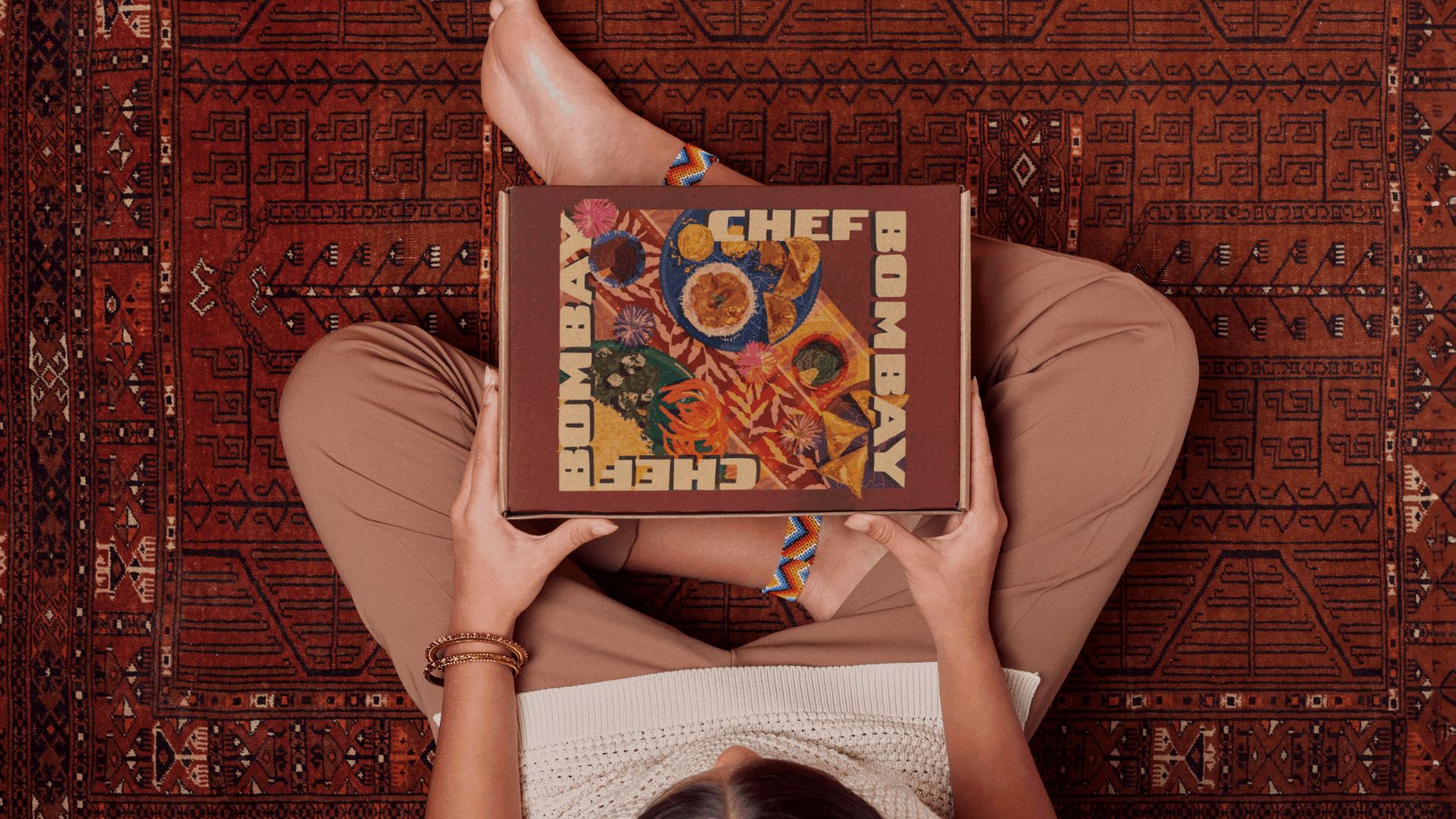
Chef Bombay
Assisted an art director on set for a video commercial for a frozen food brand and illustrated mock packaging for their 25th anniversary campaign!
Client: Chef Bombay | Hunting the Hunter
As the only Canadian South Asian frozen food brand, Chef Bombay aimed to celebrate 25 years of bringing people together over warm meals — a story I was excited to help shape
Art Direction
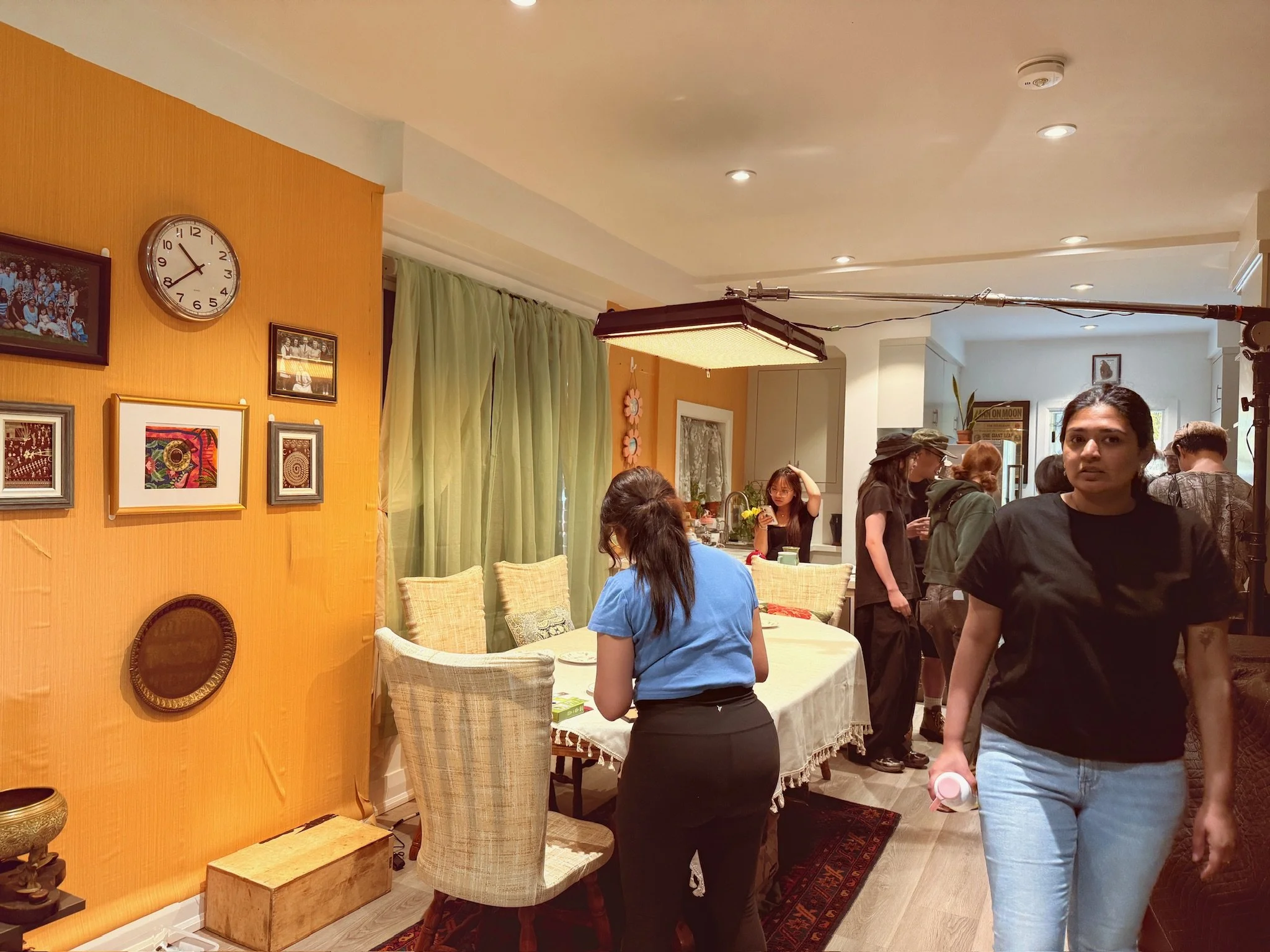
I recently stepped out of my usual design space to assist Art Director Hiral Solanki on set for a Chef Bombay commercial with Hunting the Hunter. Seeing my illustrated prints woven into the scenes while helping style tables, props, and tiny details showed me how design shapes an atmosphere beyond a screen.
Role: Art Department Assistant
Project: Brand Commercial (Multi-Era Concept)
What I did:
Assisted the Art Director in bringing a multi-era brand story to life, covering the 2000s, 2010s, and 2020s.
Supported set dressing and prop styling to capture each decade’s unique aesthetic.
Ensured visual continuity between scenes, from background styling to the smallest surface details.
Worked hands-on with the production team to keep everything aligned with the creative vision.
Paid close attention to every detail, from nostalgic prints to era-specific props, to help create a seamless, time-hopping visual narrative.
This was a project full of layers, details, and plenty of creative problem-solving on set.
You can view the commercial here: Family Times Are Frozen In Time


Packaging Design
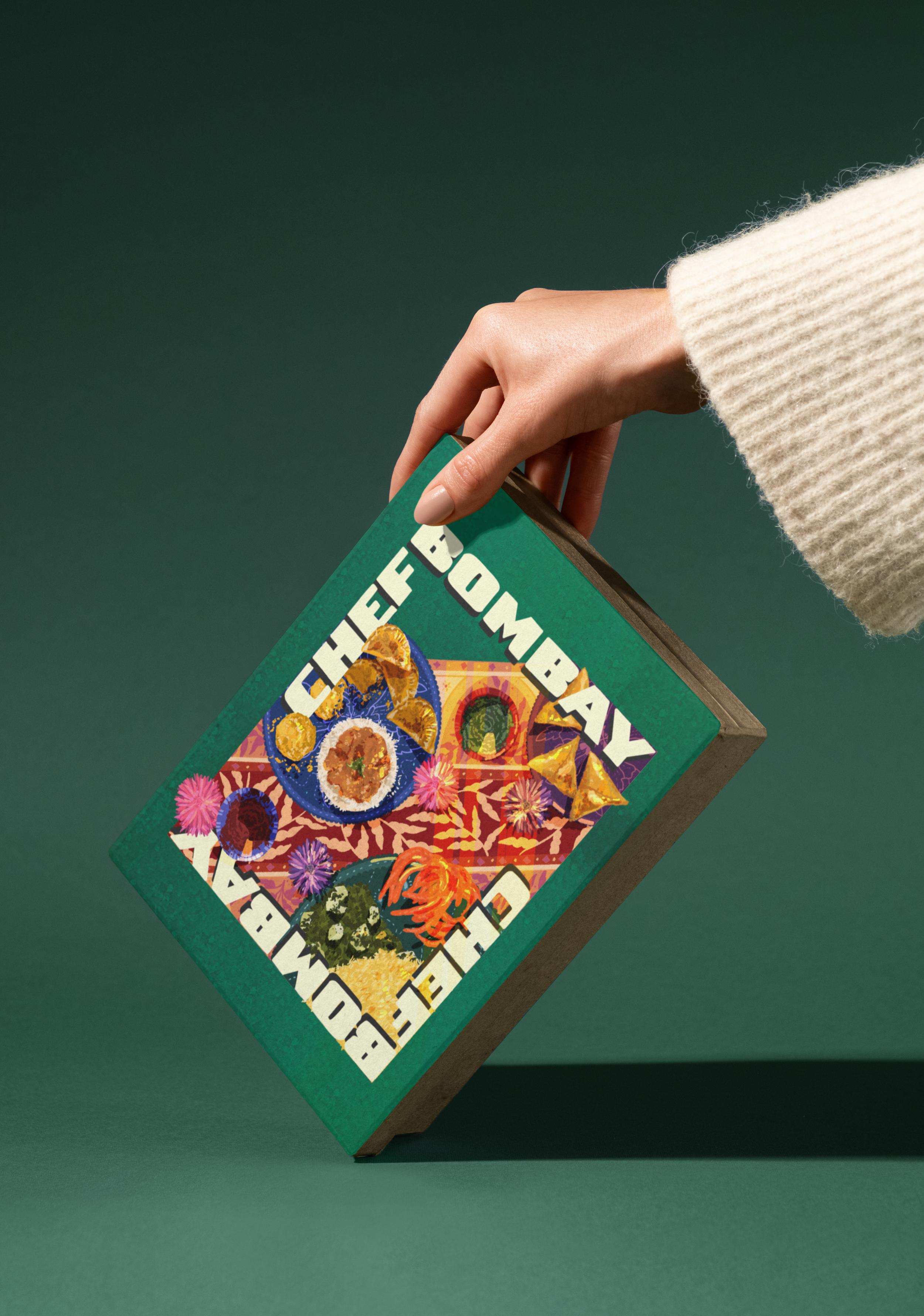
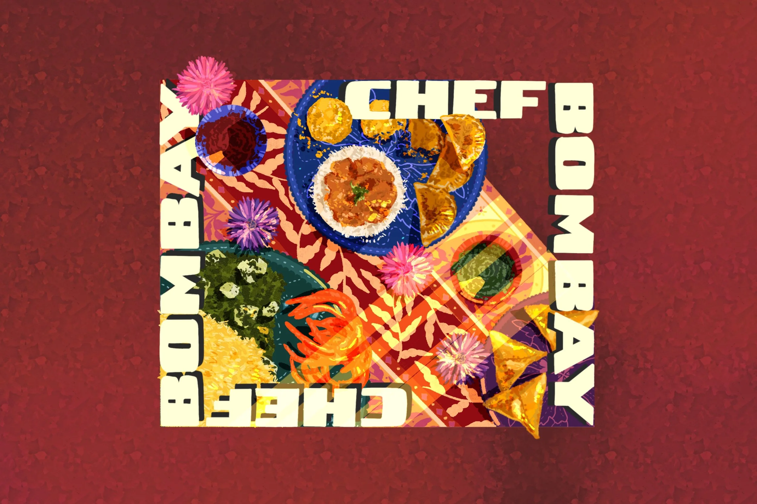
While Chef Bombay’s packaging is typically clean with a pop of colour, the heart of the brand has always been about bringing people together over warm meals, reflecting immigrant experiences built over the last 25 years. To capture this feeling, I illustrated a few of their products laid out on a dining table with a vibrant tablecloth, a runner, and scattered food crumbs shared between plates. Rays of sunshine filter onto the scene, evoking the warmth and simple joy of sharing your culture and a comforting meal with loved ones after a long day.
From Concept to Creation
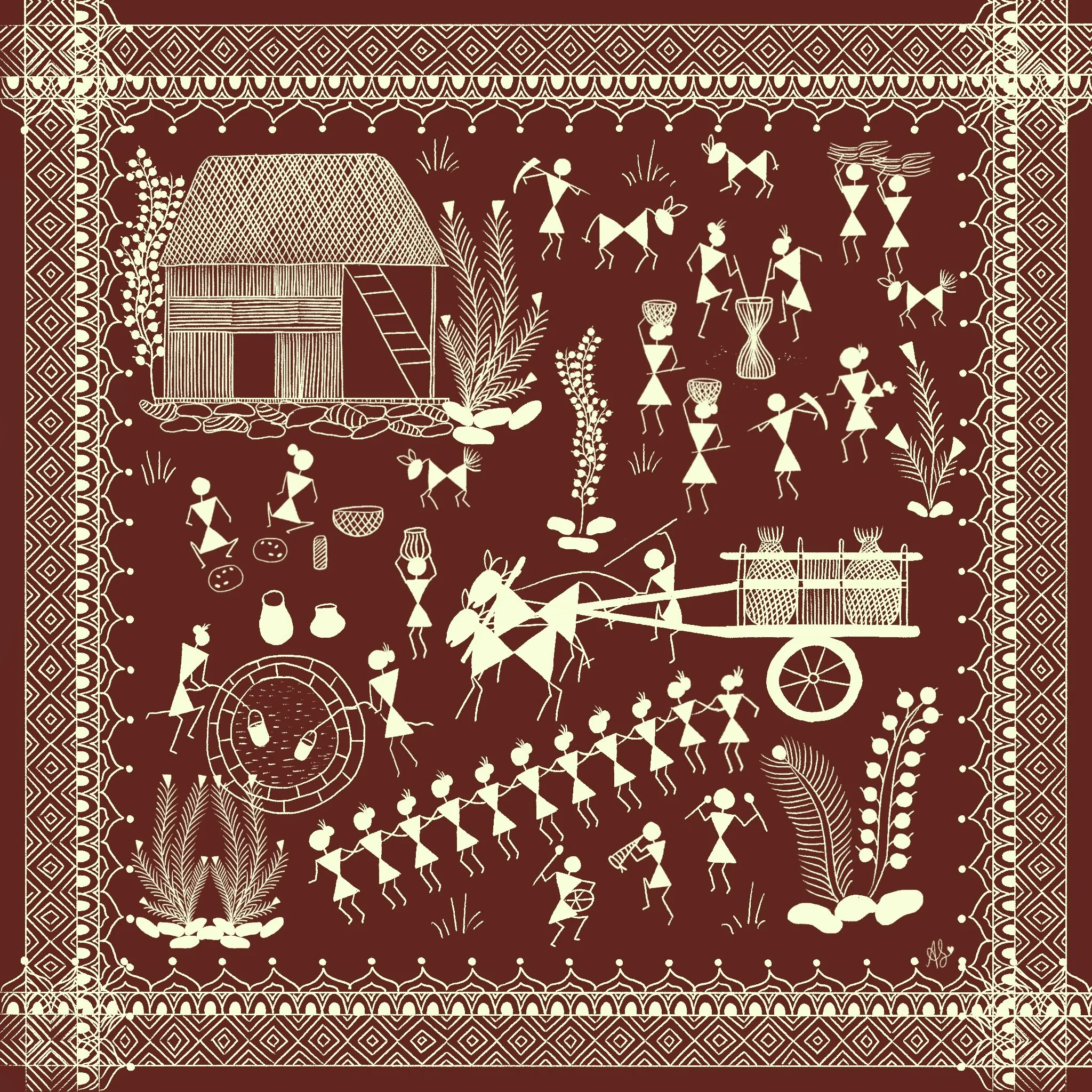
For my reference board, I collected pieces that remind me of home and the warmth of family meals. I drew inspiration from colourful, vibrant tablecloths with traditional motifs and paired them with plates that feel like small works of art. Details like food crumbs on the table and between plates hint at the lively conversations and moments shared around a meal.
Since the brand’s packaging has always featured pops of colour, I chose a palette of rich red, blue, and green to keep that spirit alive. I added colourful touches like flowers and scattered grains to create a feeling of abundance and celebration. Altogether, the final composition invites people to sit down, open the box, and enjoy an experience that feels warm, familiar, and meant to be shared.