Carachaarya

Project Overview
Carachaarya is a mobile app that enable young professionals to connect with mentors. It allows users on the visual spectrum to connect with professionals and gain career and interview advice. The application mainly focuses on users who are completely or partially blind or colourblind.
TimeLine: August 2021 - September 2021
Role: User Research, User Design (Wireframing and Prototyping), User Interface Design and Iterations
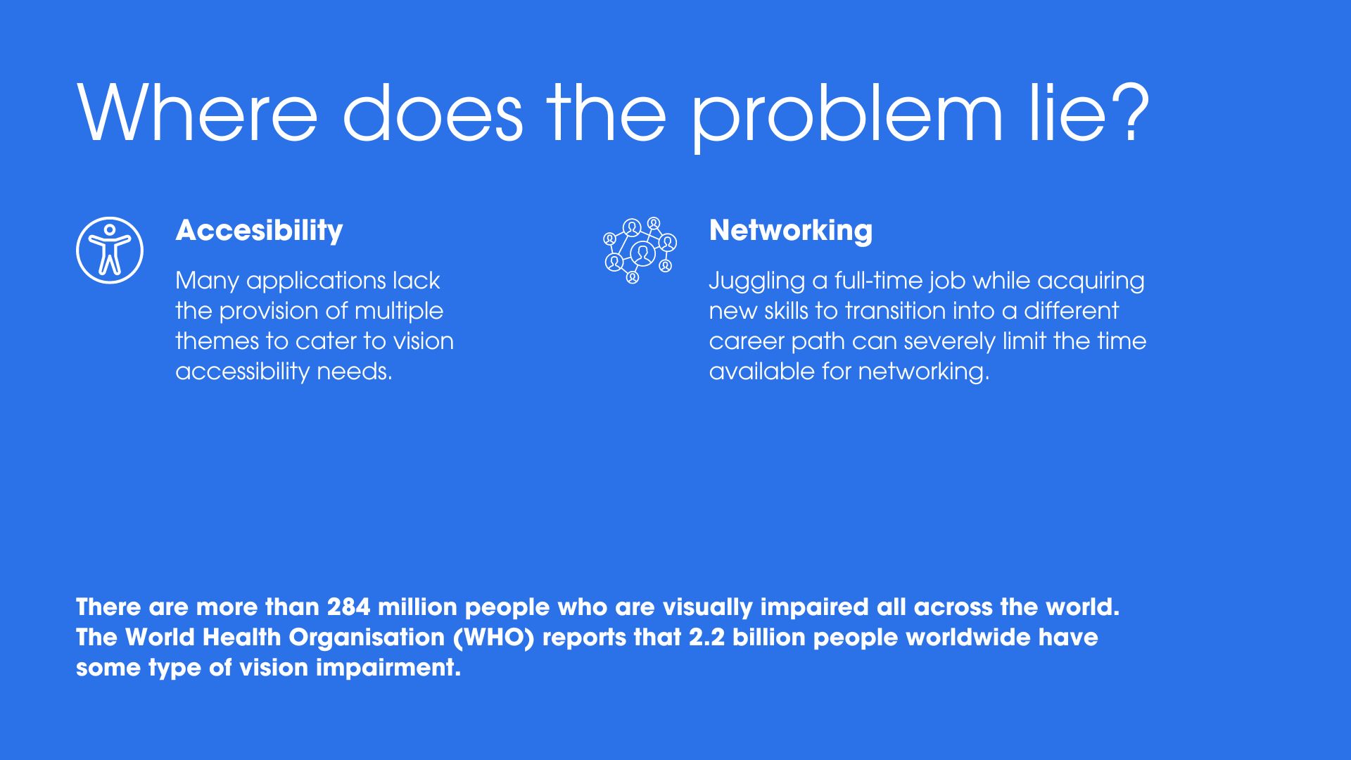
The problem I focused on
Lack of an accessible platform for young professionals to gain advice regarding personal and professional growth, has left users frustrated. Unless one follows a traditional path into a field, it is extremely difficult to get in touch with a mentor.
Project Prompt: Carachaarya is an accessible career mentorship service to help people who are blind.
Emphasis & Ideation
User Pain Points
User Personas
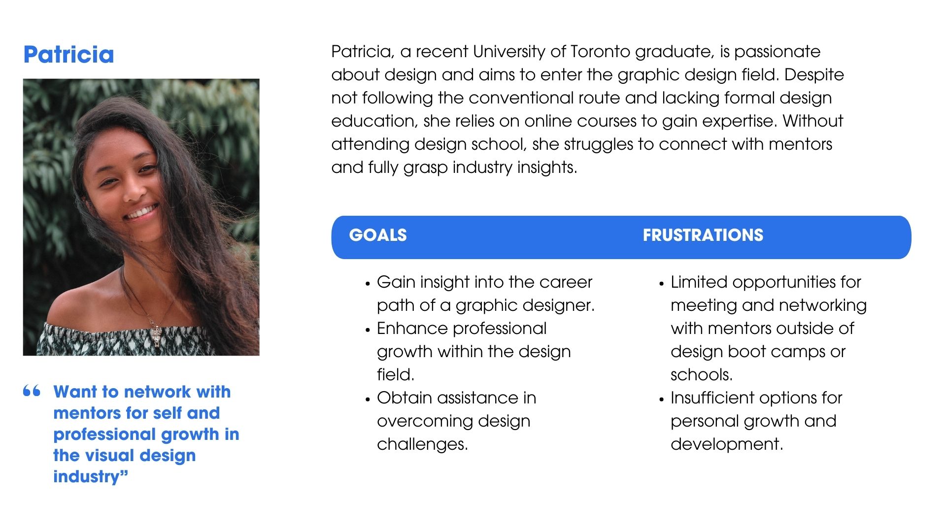
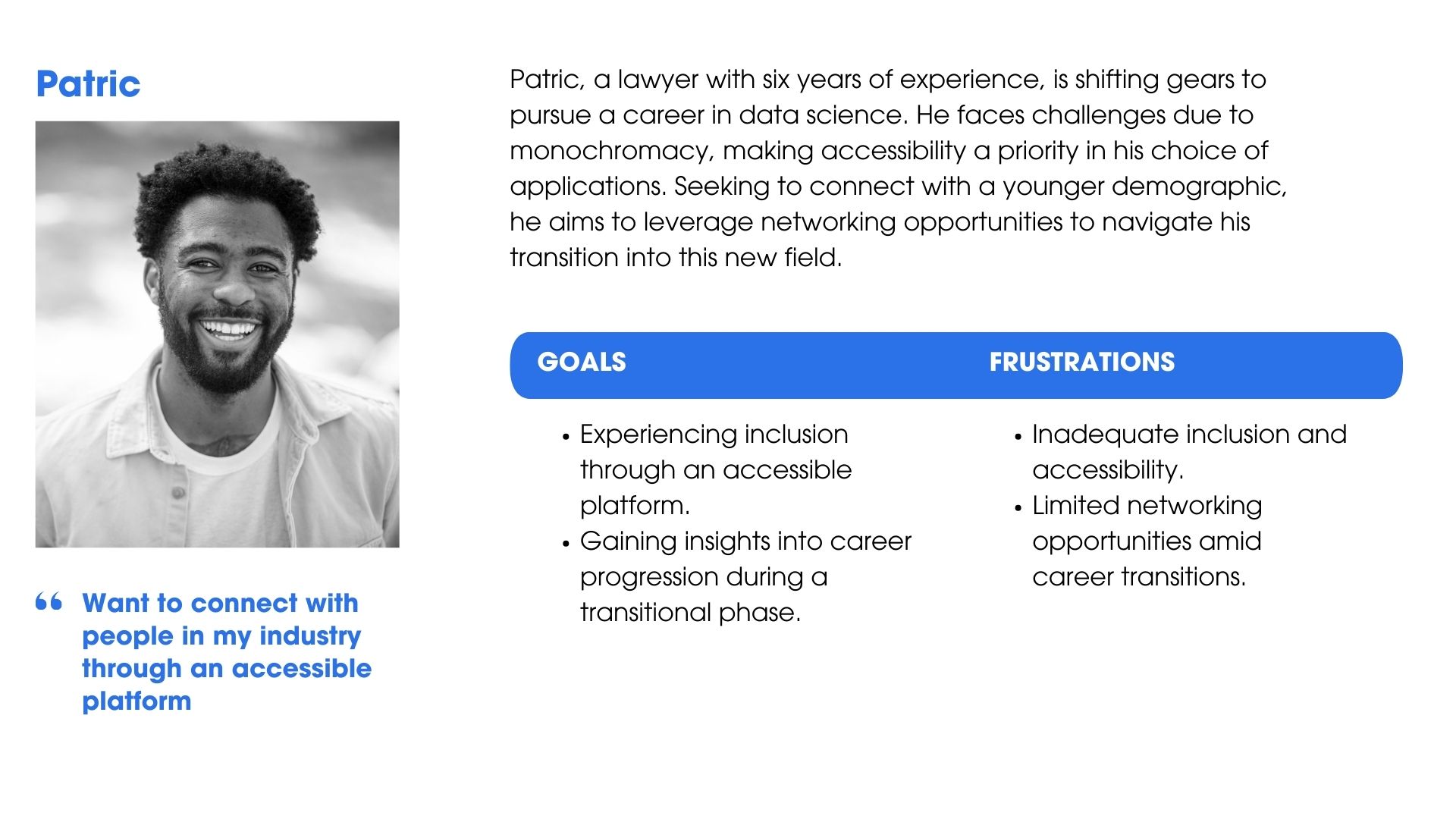
After analyzing the insights from the usability study and my secondary research about making designs accessible, I came up with two user personas. They helped me emphasize and summarize pain points I needed to address. As a part of my research I also plotted the user journey map.
Starting the Design Journey
Making accessible design choices
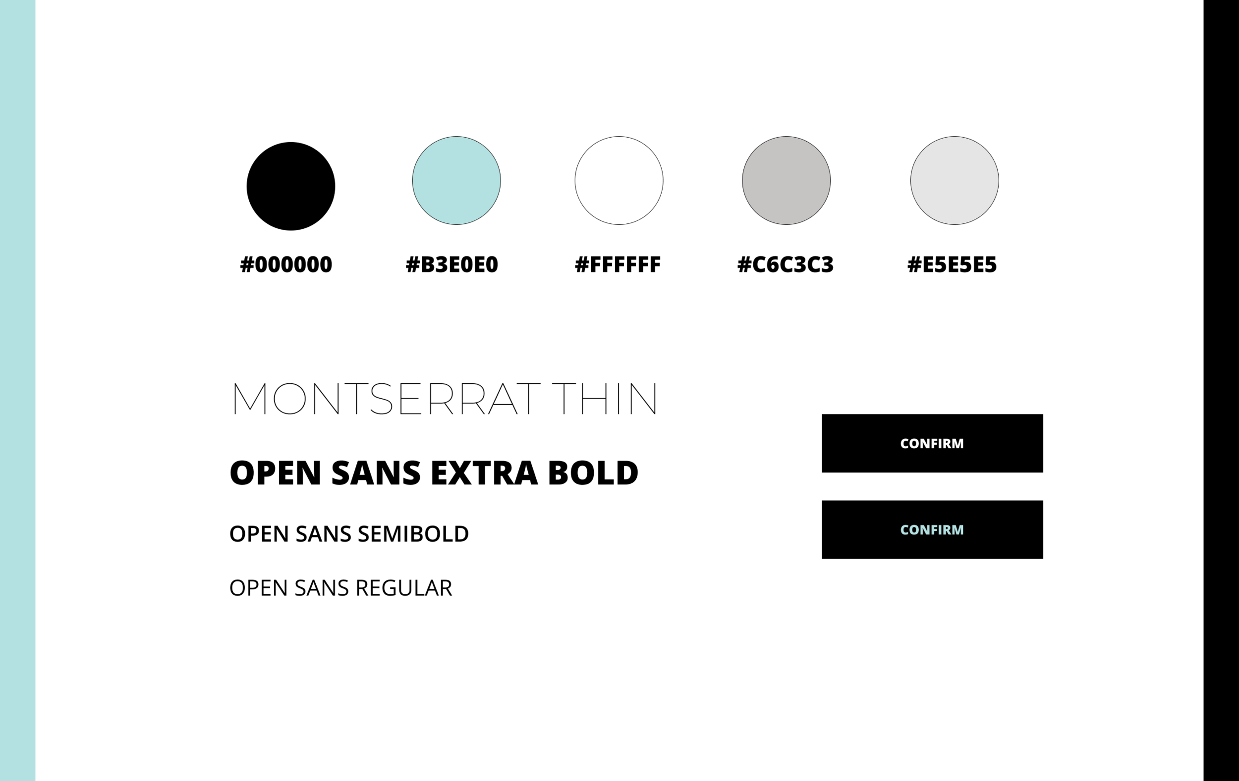
To make my designs accessible, I came up with a colour palette that passed both the AA and AAA contrast test. The original theme has the first two colours while the accessible theme includes a monochrome colour palette. While the original theme works for most users on the visual spectrum, the accessible theme was created for users suffering from achromatopsia.

Visualization of the paper wireframes
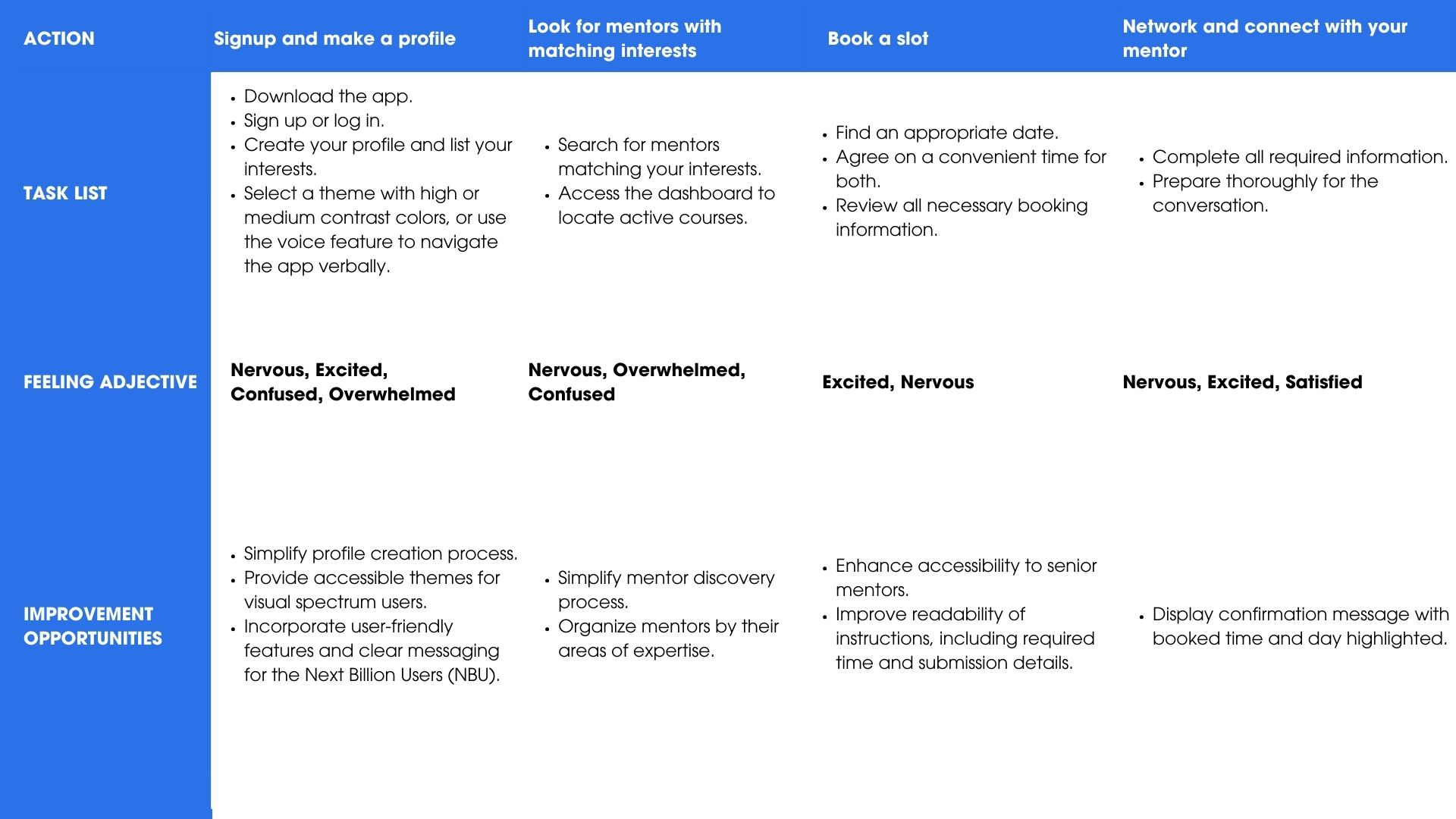
After multiple iterations of the navigation menu, I highlighted the features I wanted to retain. The final iteration of the dashboard includes a microphone button, allowing blind users to easily enter or search for their desired information.
Redefining the designs
A second round of the usability studies helped refine the final designs and provided these insights:
Users wanted an increased font size on the accessible theme with a higher contrast ratio
Users wanted information about their video call slot on the confirmation page
Users appreciated the use of icons and instead of just text to deliver information

Original Theme

Accessibility Theme
Reflection
This was my last case study as a part of Google’s UX Design certification and the one I had the most fun with. It was my first project that involved designing for visually impaired users and social good. Users appreciated the use of icons to convey information. For my next project, I would:

Play around with whitespaces and font sizes and create minimalistic designs
Conduct more secondary research as it helped me learn more about visually inclusive designs
Explore designing for a range of users on the spectrum including the next billion users.